Role & Responsibilities
As Head of Design, I led the development of the design system from concept to implementation.
My responsibilities included designing the system architecture, defining key components.
Discipline
Design System, UI/UX Design, Product Strategy
Team structure
Product manager · 2 UX designers · 4 engineers
Zeda.io was scaling faster than its interface could stay consistent. I led the design system effort to standardize reusable components, reduce rework, and help the team ship features faster across the platform.
Overview
Scaling consistency in a fast-moving startup
In an early-stage startup like Zeda.io, speed was important, but so was consistency. Fast product growth exposed the cost of rebuilding patterns without shared rules. The system gave the team a shared foundation to design, build, and scale product features faster while improving overall product quality.
The challenge
Maintaining consistency while scaling fast
Zeda.io was adding new features quickly across multiple product areas. As the product grew, maintaining a consistent experience became difficult without a standardized design system. Different teams were recreating similar UI patterns in different ways, which led to visual inconsistencies, slower development, and more effort during design handoff. The challenge was to create a shared system that could support faster feature delivery while keeping the product experience consistent and scalable.
Inconsistent UI
Common patterns like buttons, forms, cards, tables, filters, and status elements had visual and behavior differences across the platform. This made the product feel fragmented for users.
Slow development
Without reusable components, developers had to rebuild similar UI elements for different features. This increased implementation time and created more back-and-forth during handoff.
Poor scalability
As the product expanded, it became harder to maintain consistency across modules. The team needed a shared foundation that could support new features without creating more design and development debt.
Identifying gaps through design audit
Auditing the product to find what needed to be standardized
Before creating the design system, I conducted a detailed audit of the existing Zeda.io interface to understand where inconsistencies were happening. The audit showed inconsistency was a system problem, not a screen problem. It gave the team a clear view of why a unified design system was needed.
Key metrics
75%
Components lacked consistency across different screens.
60%
UI elements were duplicated or slightly modified across product areas.
80%
Design revisions were caused by the lack of reusable components and clear usage guidelines.
Audit insights
Screens had inconsistent typography, color usage, spacing, and button styles.
Common UI elements were often recreated with small differences, which made the product harder to maintain.
The absence of design tokens created inconsistencies in spacing, colors, typography, radius, and component states.
The audit helped define the first set of priorities for the design system and gave the team a clear reason to move toward a shared component library.
Driving design system adoption
Showing the value beyond reusable components
In an early-stage startup, introducing a design system can feel like extra process. A design system had to help teams ship faster, not slow them down. To build adoption, I positioned it around speed, reduced rework, and consistency at scale.
Improve efficiency
Reusable components reduced repeated design and development work across common product patterns.
Ensure consistency
A shared system helped new features follow the same visual language, interaction behavior, and component rules.
Reduce rework
Clear component specs and usage guidelines reduced back-and-forth during handoff and implementation.
Support Growth
The system gave the team a scalable foundation to build future features without reinventing UI patterns each time.
Design approach
Building the system from foundations to reusable product patterns
We built from tokens to reusable patterns so the system could scale. This created a clear hierarchy where foundations, components, and product patterns could support future Zeda.io workflows.
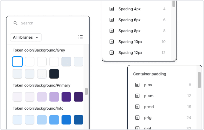
Design tokens
Design tokens are the core styles such as colors, typography, spacing, and shadows. These elements form the foundation of the system, ensuring consistency and scalability across all components.
Atom
We created reusable UI elements like buttons, icons, and input fields, which served as the essential building blocks for more complex components in the system.
Molecule
Atoms were combined to form more complex components like forms and cards, ensuring modularity and flexibility throughout the system.
Organism
Molecules were further grouped into fully functional sections like headers, footers, and navigation bars, allowing for consistency and scalability across the platform.
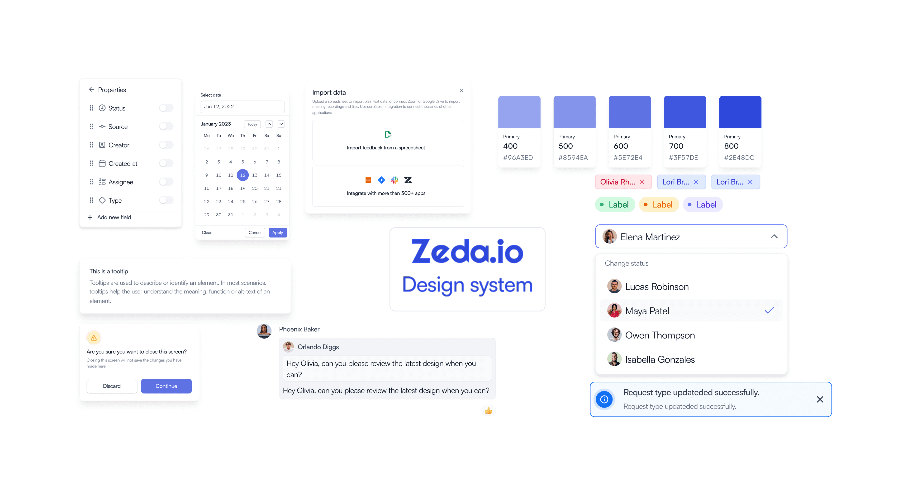
Components
Standardizing reusable UI patterns
I created a reusable component library for common workflows across Zeda.io. The focus was on components that appeared frequently in the product and had the highest impact on consistency, speed, and scalability.
Reusable components turned design decisions into production-ready product language teams could share. They helped designers reuse patterns, gave engineers clearer guidance, and reduced repeated UI work.
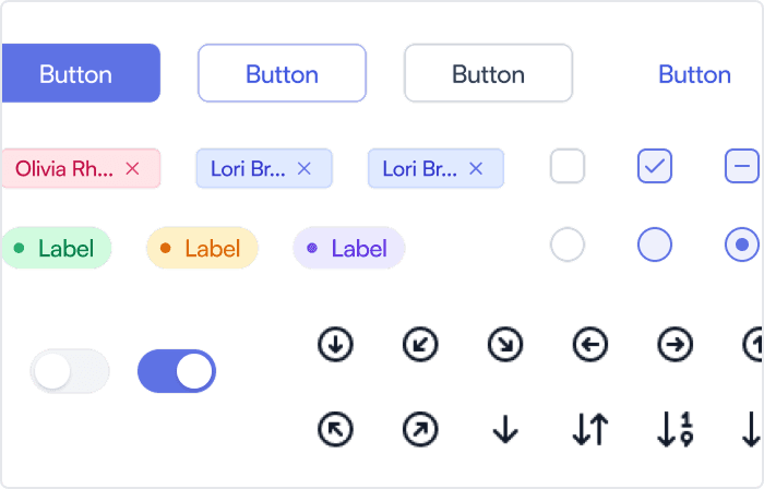
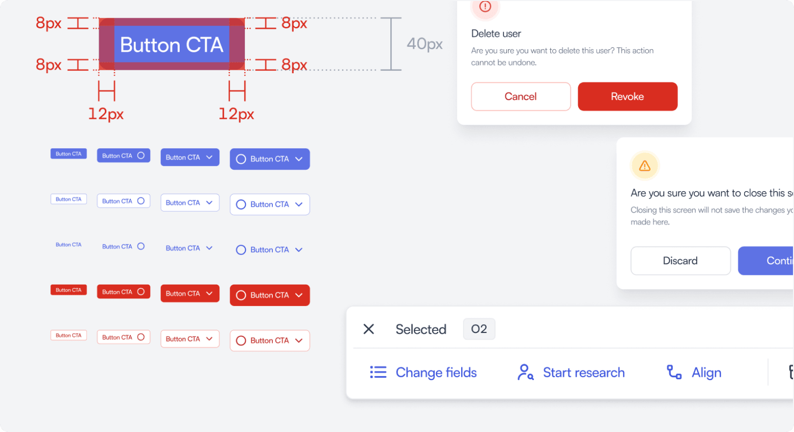
Button component
Buttons were standardized across primary, secondary, tertiary, danger, and icon-based actions. I defined sizing, spacing, hierarchy, and states to create a consistent action system across the product.
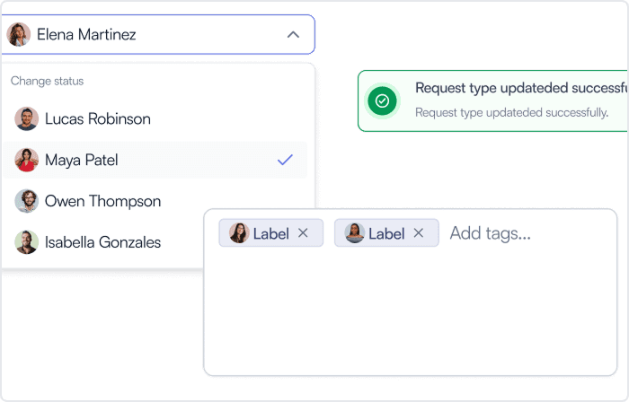
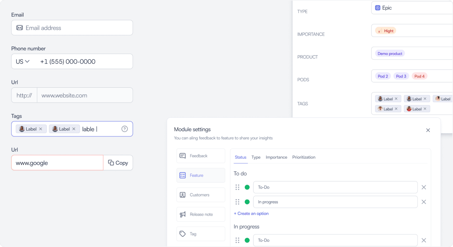
Input fields
Input fields were standardized for form-heavy workflows across feedback, roadmap, customers, features, and settings modules. The component covered labels, helper text, validation, error states, dropdowns, and tag inputs to make forms more predictable.
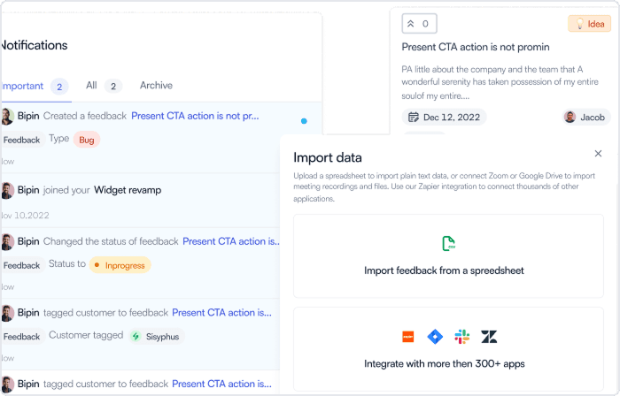
Cards
Cards were used across dashboards, summaries, object previews, setup flows, and product sections. I created flexible card patterns with consistent spacing, hierarchy, actions, and states so they could adapt to different use cases.
Collaboration with development
“Worked with cross-functional development teams to turn the design system into reusable, production-ready components.”
Outcomes
The system reduced rework while improving consistency across product areas.
32%
Faster Feature Rollouts
Reusable components helped reduce design and development time, making it easier to ship new features faster.
400+
Components counts to scale
The library included 400+ reusable components and patterns, helping teams maintain consistency across product areas.
28%
Improvement in Design Consistency
Standardized tokens, components, and usage rules helped reduce visual inconsistencies across the platform.
24%
Reduced Development Errors
Clear component specs and reusable patterns reduced implementation errors and design clarification loops.
Learnings
Design systems work best when grounded in real product use cases. Getting stakeholder alignment early helped the team understand the system's long-term value and adopt it with less friction.
Early Buy-In is Crucial
Getting stakeholder alignment early helped the team understand the long-term value of the design system and adopt it with less friction.
Collaboration Across Teams is Key
Working closely with development and QA helped ensure the system was practical, reusable, and aligned with production needs.
Scalability is a Must
Building with scalability in mind made it easier to support new features, modules, and product workflows as Zeda.io grew.
User-Centered Design Systems Work Best
The system worked best when components were designed around real product use cases, not just as isolated UI elements.