Role & Responsibilities
Head of design
Owned end-to-end UX and product strategy
Led a team of 2 designers
Shipped a scalable, user-centered system with product and engineering
Discipline
UX design · product strategy · design systems
Team structure
Product manager · 2 UX designers · 4 engineers
Zeda.io was growing faster than its product experience could support. It needed a more focused and modern product experience for product strategy, discovery, and roadmap workflows. I led the redesign of the core platform experience, simplifying complex workflows, improving navigation, and creating a cleaner, more scalable interface for product teams.
Overview
Complex workflows were blocking adoption and engagement.
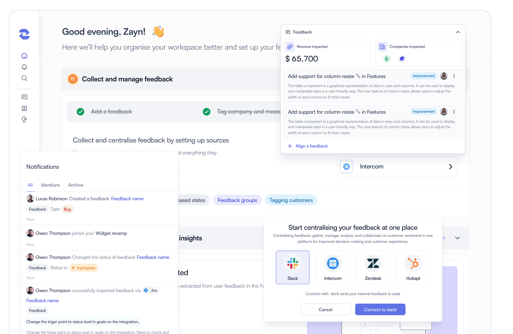
Zeda.io is a B2B product that helps teams centralize and act on customer feedback, but growing feature complexity made the experience harder to navigate. Users struggled with onboarding and discoverability, and struggled to experience value early in the journey.
This project focused on simplifying workflows and creating a more intuitive, scalable experience to improve engagement and adoption.
The challenge
Users struggled to experience value early.
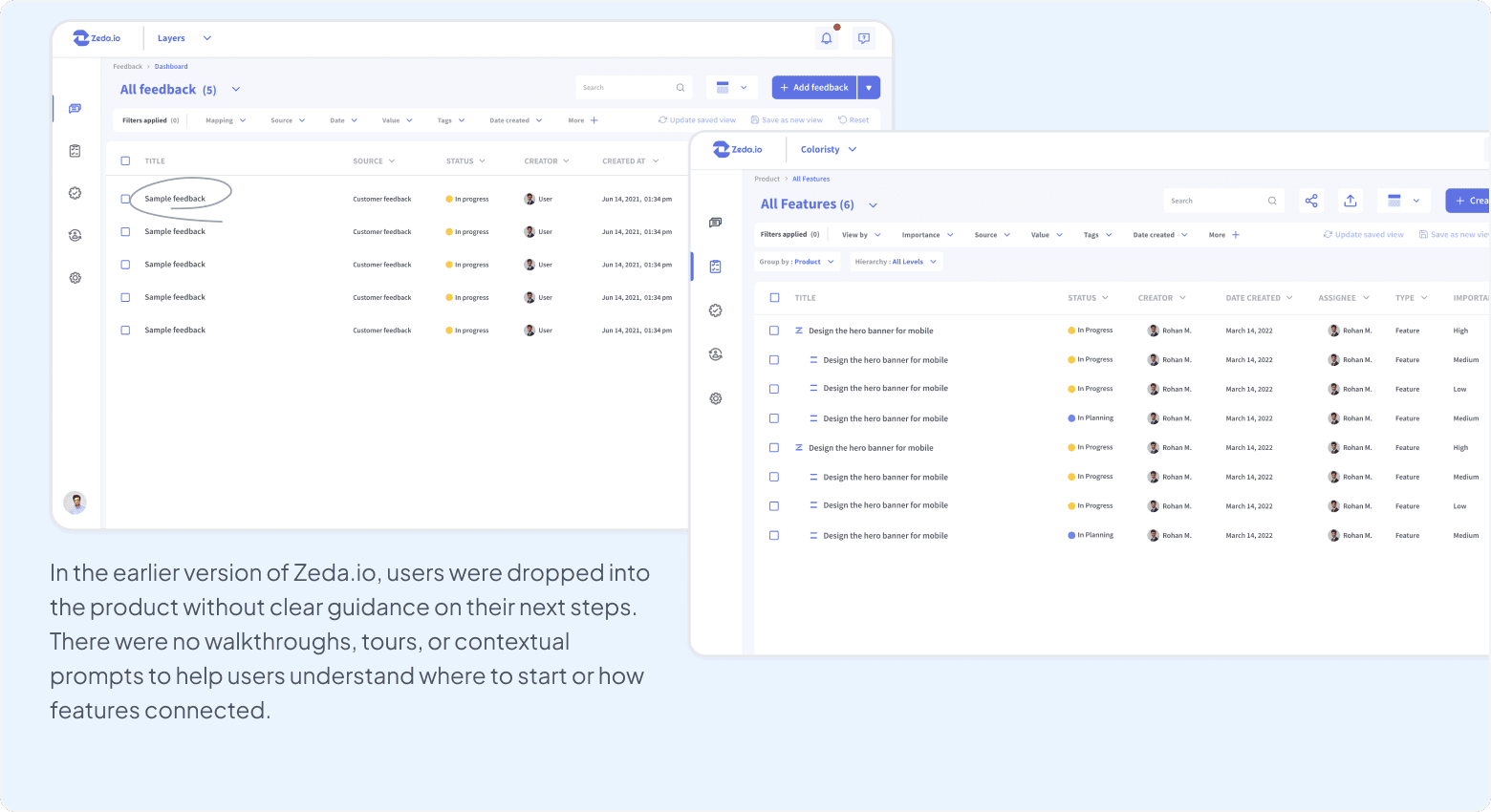
Zeda's growing feature set made the product powerful, but increasingly difficult for users to understand, navigate, and adopt.
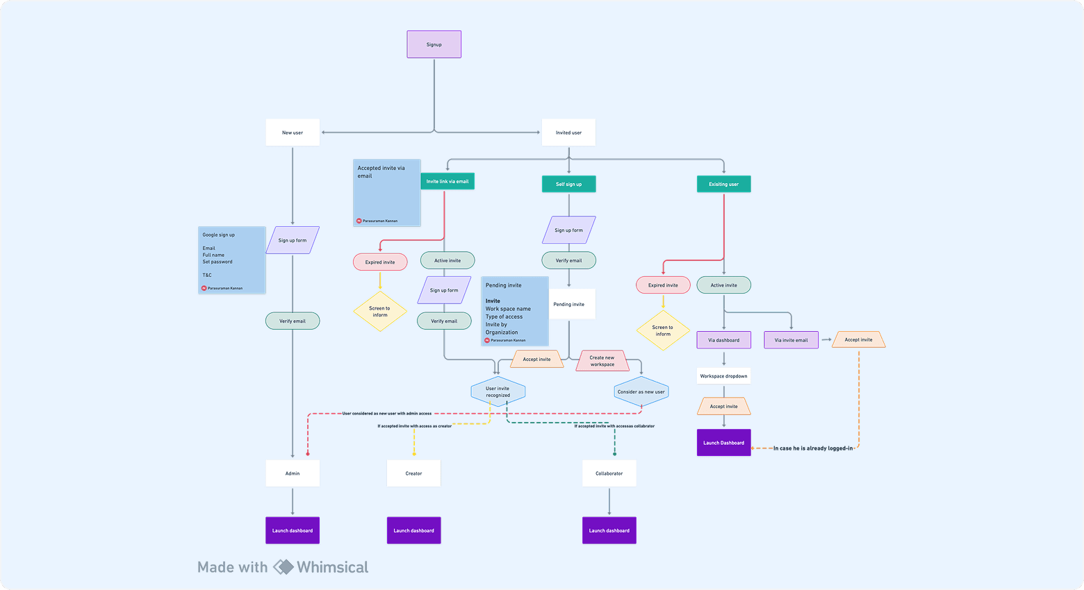
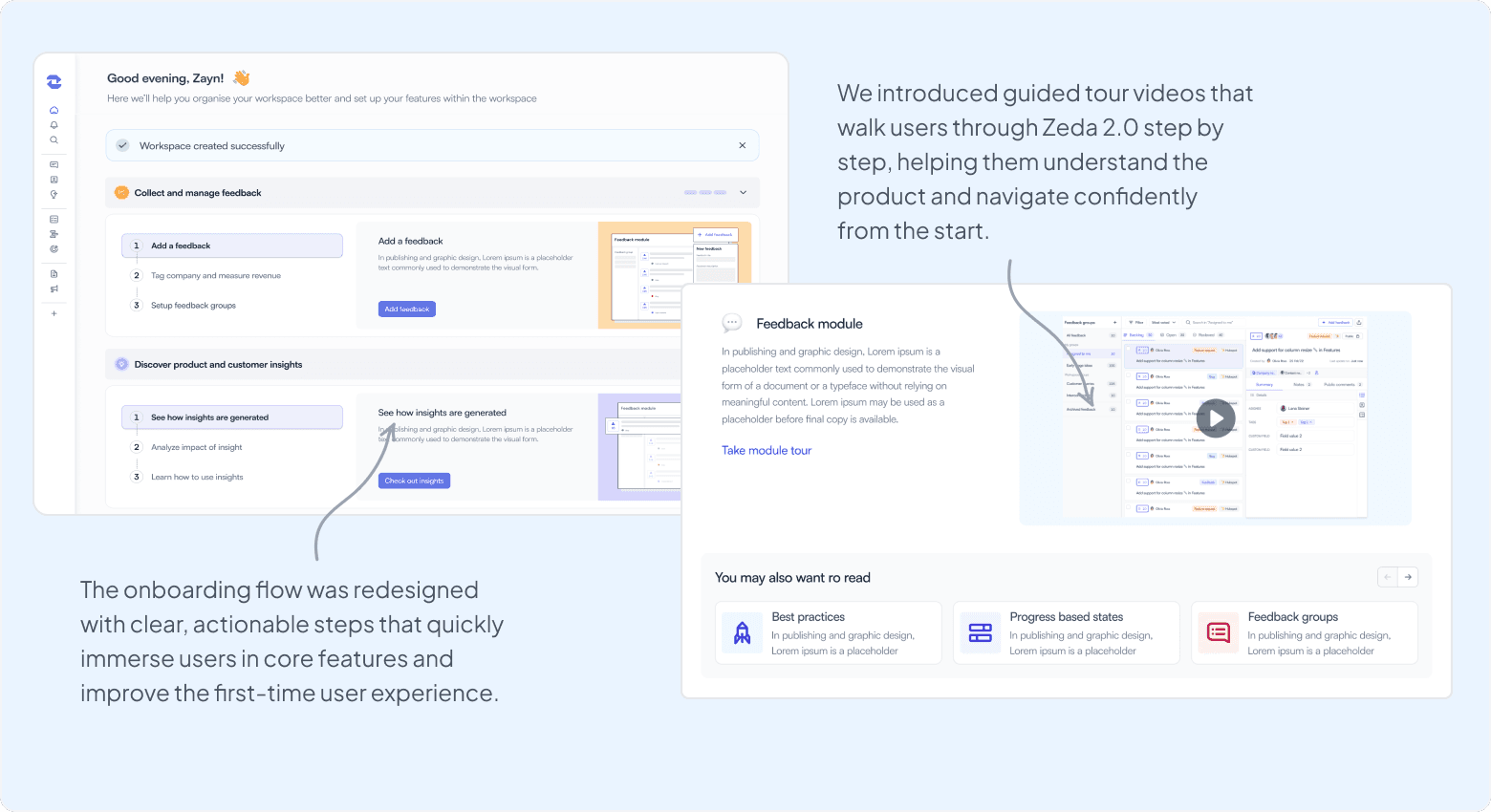
Complex onboarding
The onboarding flow introduced too many steps upfront, overwhelming users before they experienced real value.
Difficult navigation
As the product evolved, navigation became fragmented, making it hard for users to find and use key features.
Low feature discoverability
Important capabilities were buried across the interface, reducing clarity and perceived product value.
User interviews and testing
Identifying friction points in the early user journey
To understand where users were struggling, we conducted interviews and usability tests with existing Zeda.io users, focusing on onboarding, navigation, and feature discovery.
Key metrics
65%
High early drop-off
83%
Low short-term retention
4%
Poor trial conversion
These metrics revealed a consistent pattern: users struggled to experience value early, disengaged after initial exploration, and rarely converted from trial to paid. Onboarding demanded too much effort before users understood the product's value, while unclear navigation and poor feature discoverability added more friction.
Key insights
Keep the experience simple from the start
Too many features and setup steps were introduced early, making it difficult for users to understand where to begin or what to do next.
Improve feature discoverability and relationships
Users needed a clearer mental model for how feedback, insights, roadmap decisions, and feature work connected.
Help users realize value earlier
Many users failed to experience a clear aha moment in the first few sessions, leading to early disengagement during the trial period.
Design response
Simplified onboarding
High-effort onboarding before users saw value
The earlier onboarding flow asked users to complete multiple manual steps upfront, even before they understood the product's value. This created early friction and caused many users to drop off before completing setup.
Problem: Users were required to provide extensive information early, leading to frustration, slow progress, and poor first impressions.
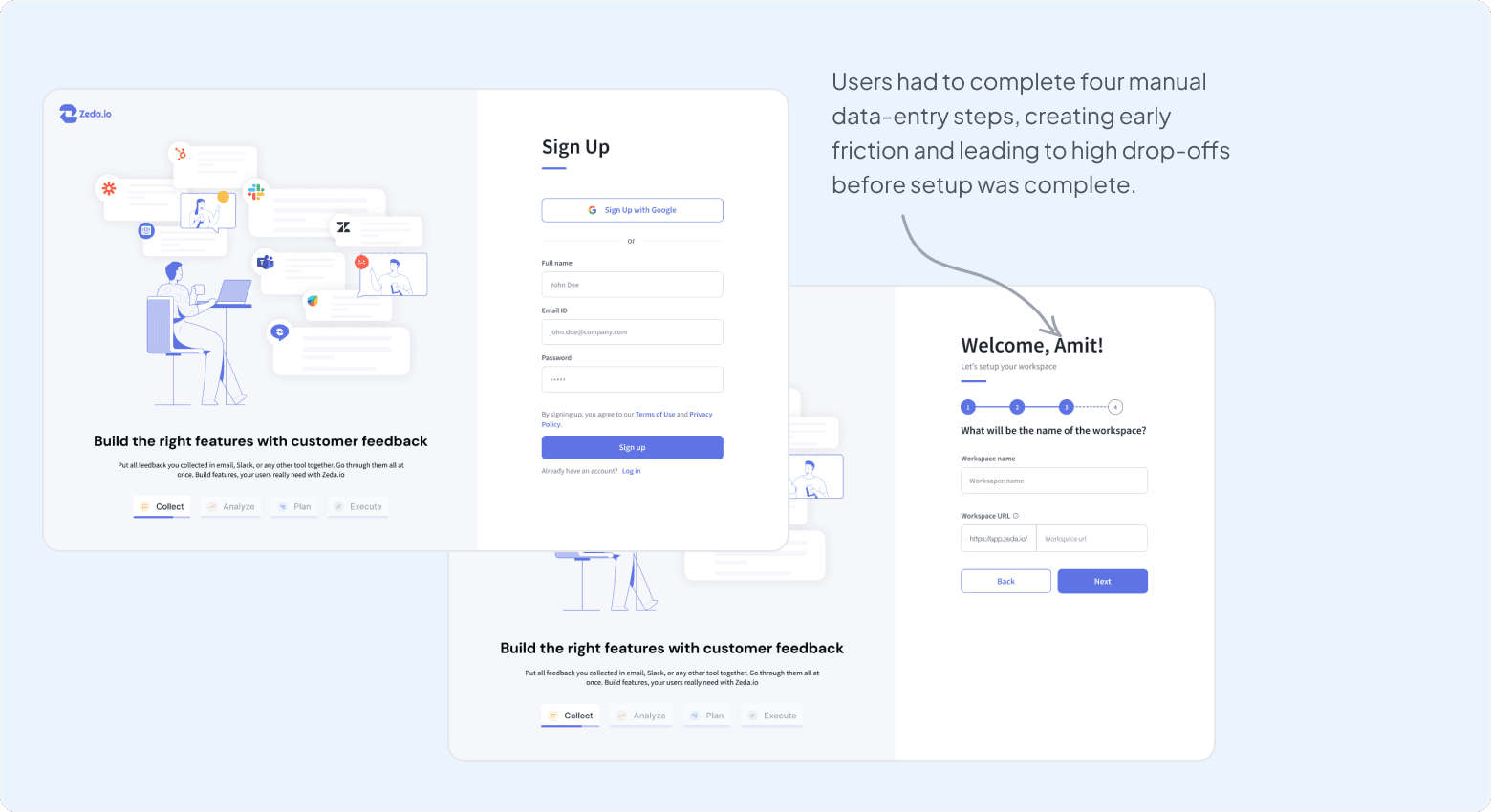
Helping users reach value faster
The goal was to reduce friction before asking users for commitment.We simplified onboarding, clarified navigation, and surfaced value earlier through automation, progressive disclosure, and clearer guidance.
Design principle: Reduce effort before asking for commitment.
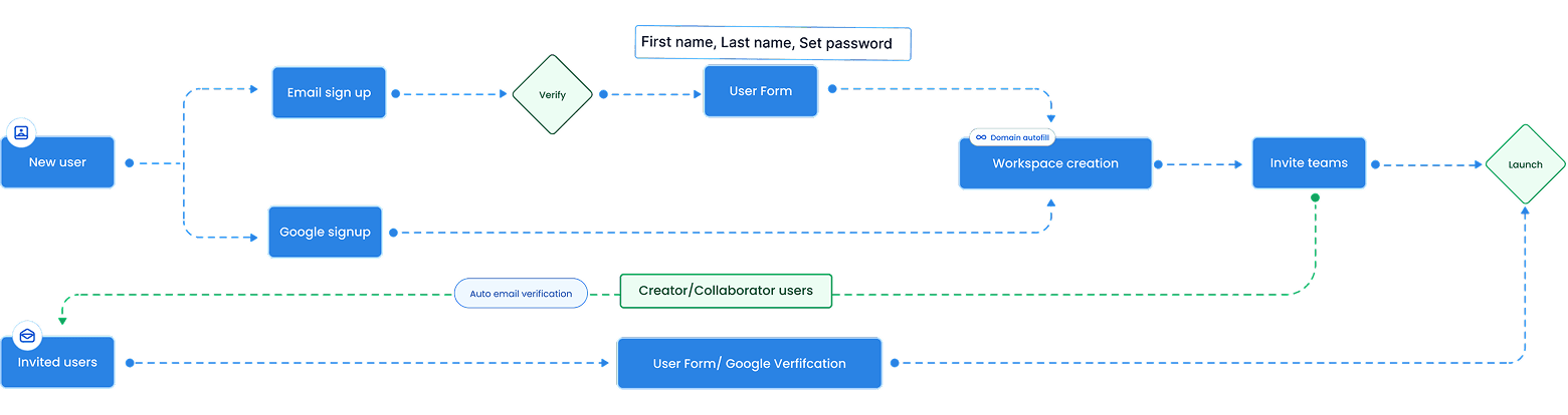
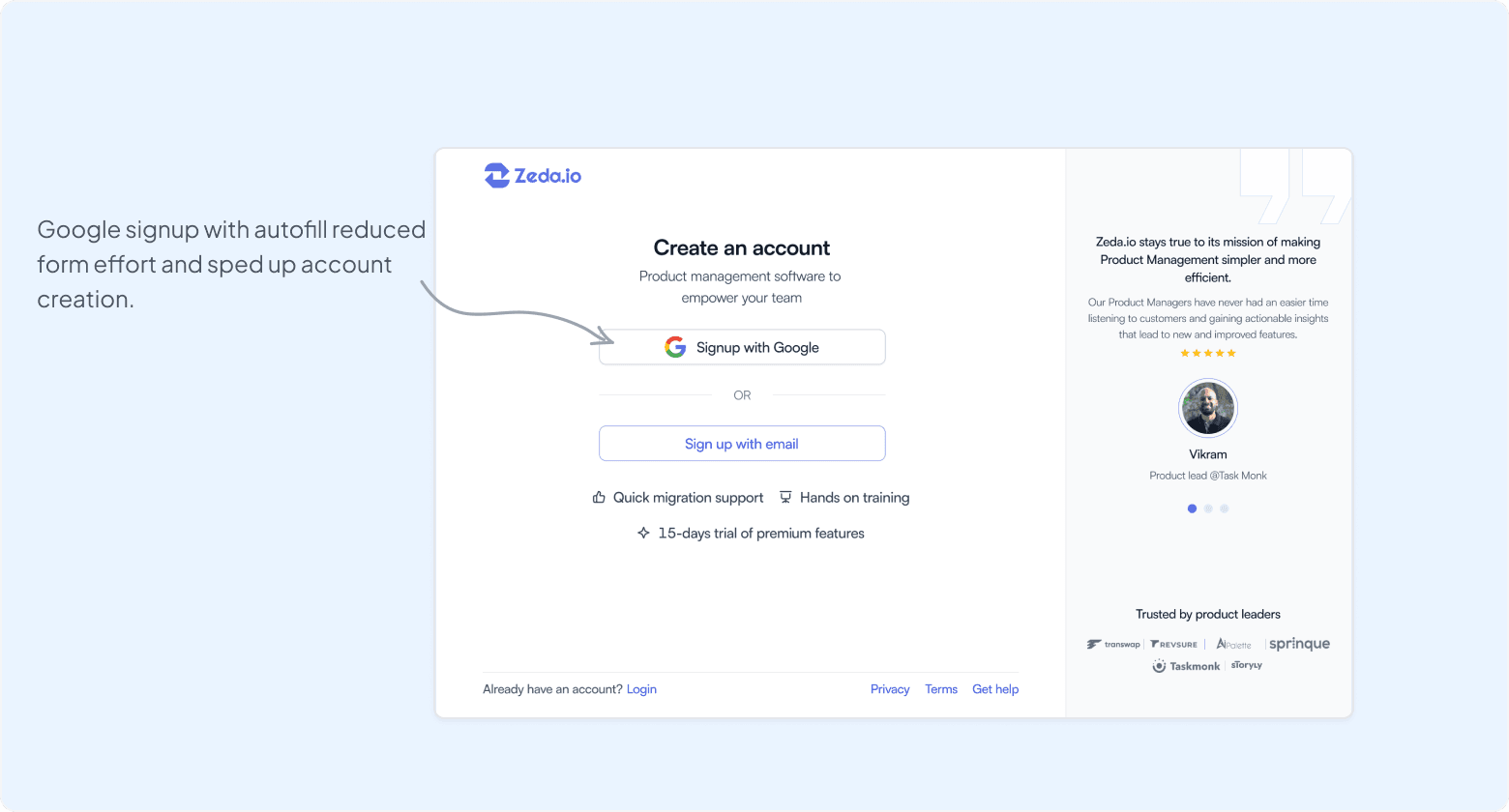
Google signup with autofill
Reduced form completion effort and sped up account creation.
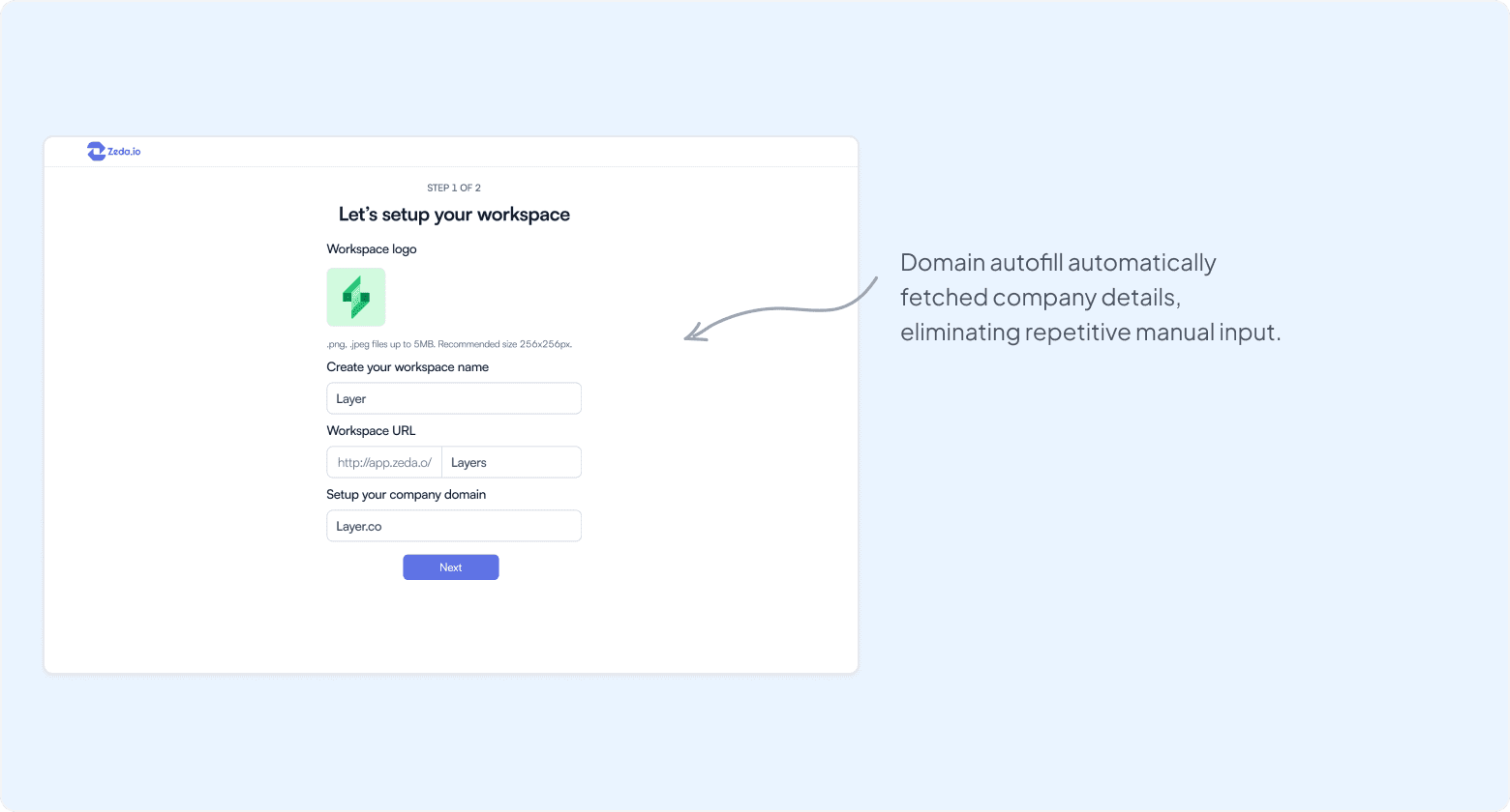
Company domain setup
Automatically fetched company details to eliminate manual data entry.
Guided workspace setup
Helped users reach their first meaningful action quickly.
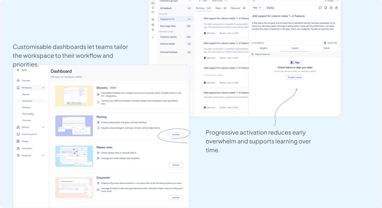
Streamlined navigation
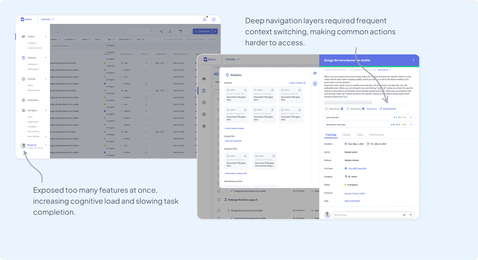
Overloaded navigation buried key workflows
The earlier navigation exposed all features at once, creating information overload and making it difficult for users to quickly locate relevant tools. Too many features were exposed too early, increasing cognitive load, which led to confusion and reduced engagement.
Problem: An overly complex navigation structure made core workflows hard to discover and slowed down everyday tasks.
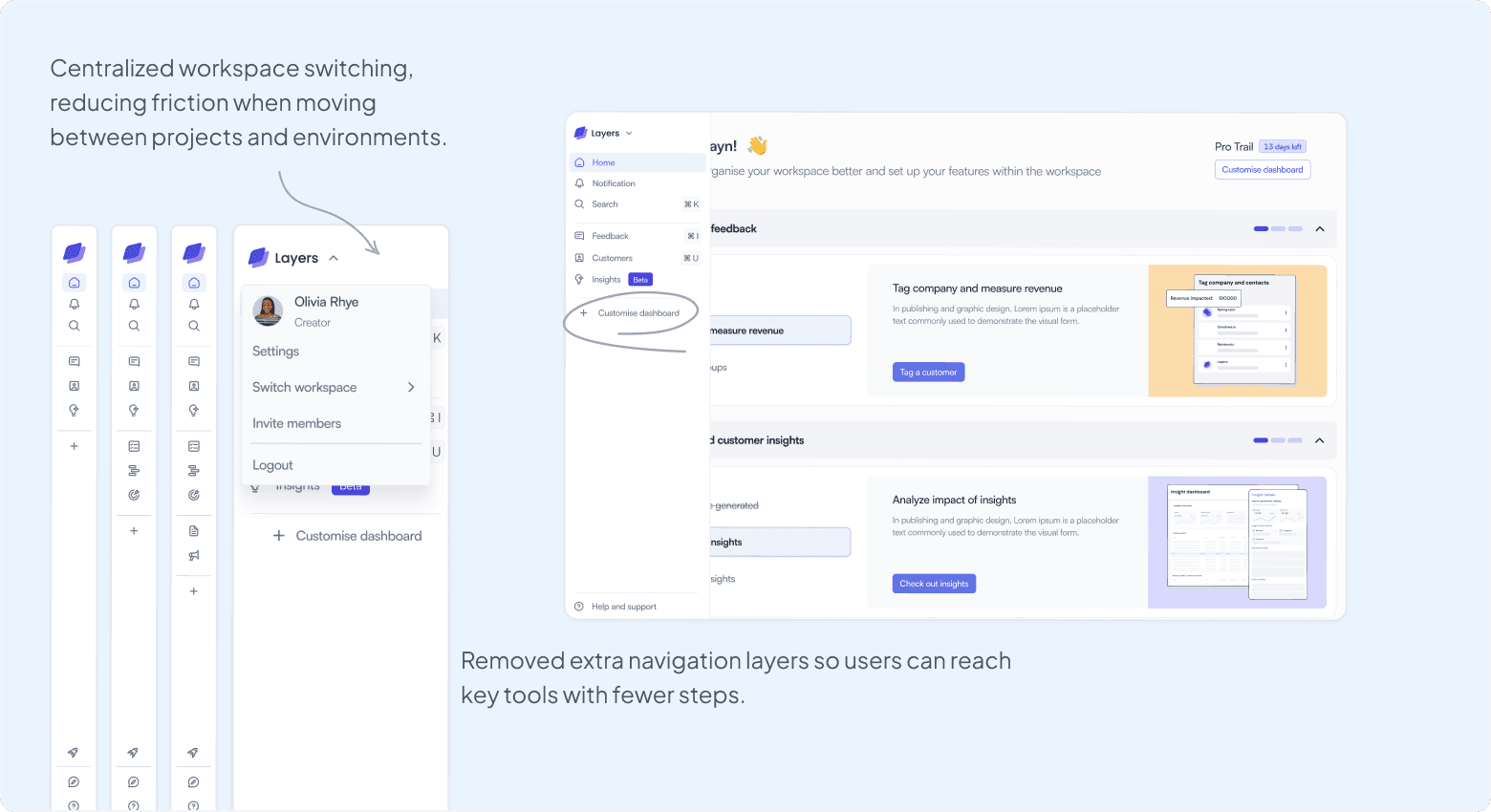
Reducing cognitive load through modular access
We simplified navigation by introducing modular access and clearer hierarchy, allowing users to focus on the tools relevant to their workflow while keeping advanced functionality accessible when needed. Progressive disclosure helped users focus on what mattered most.
Design principle: Reveal functionality as users need it, not all at once.
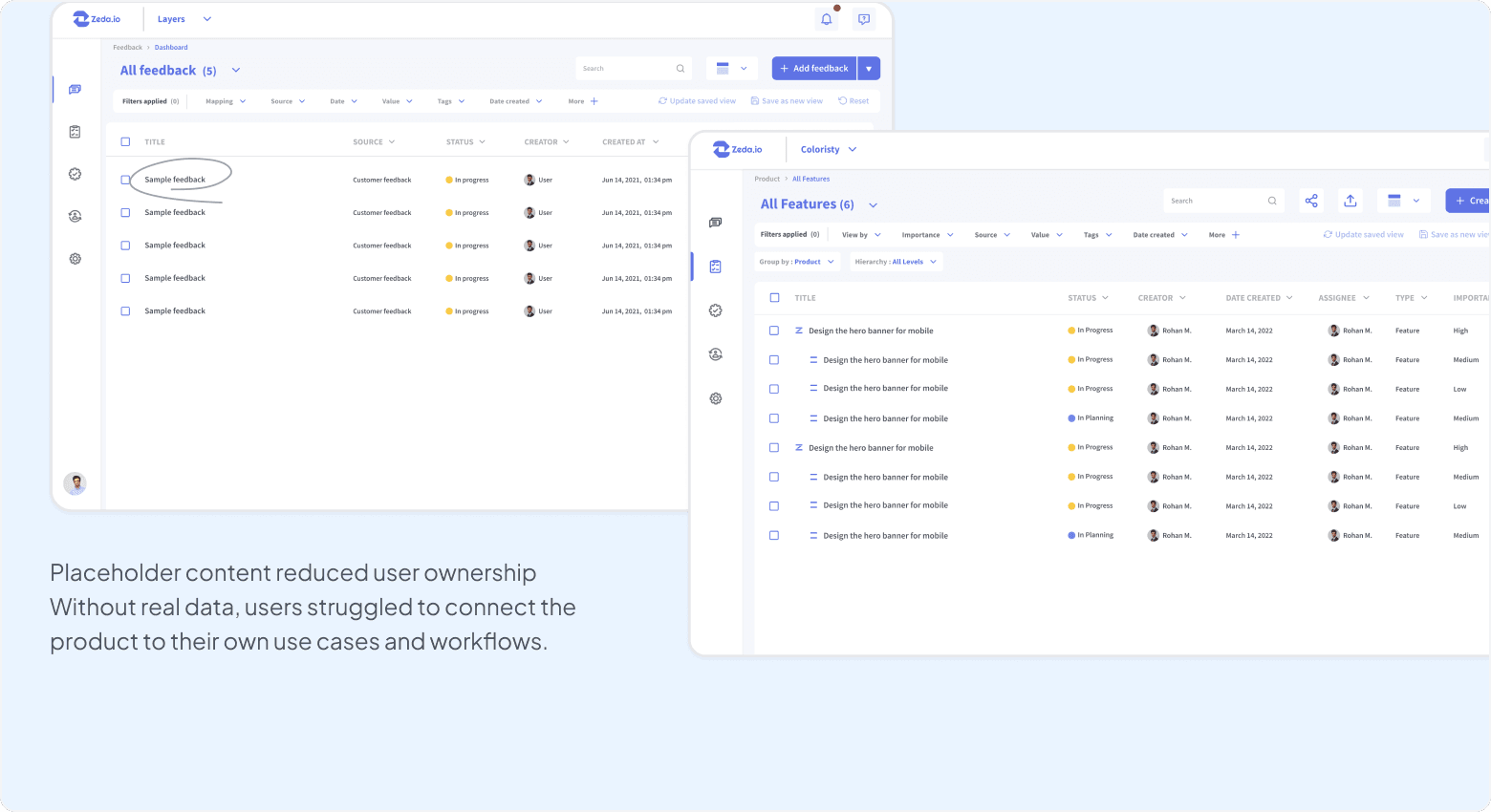
Nudges for personalization
Generic placeholder data reduced relevance and engagement
In earlier versions, Zeda automatically populated sample placeholder data to avoid empty states. While this helped users get started, the data lacked real-world relevance and failed to create a sense of ownership.
Problem: Generic placeholder data and a lack of prompts reduced engagement and delayed meaningful interaction with the product.
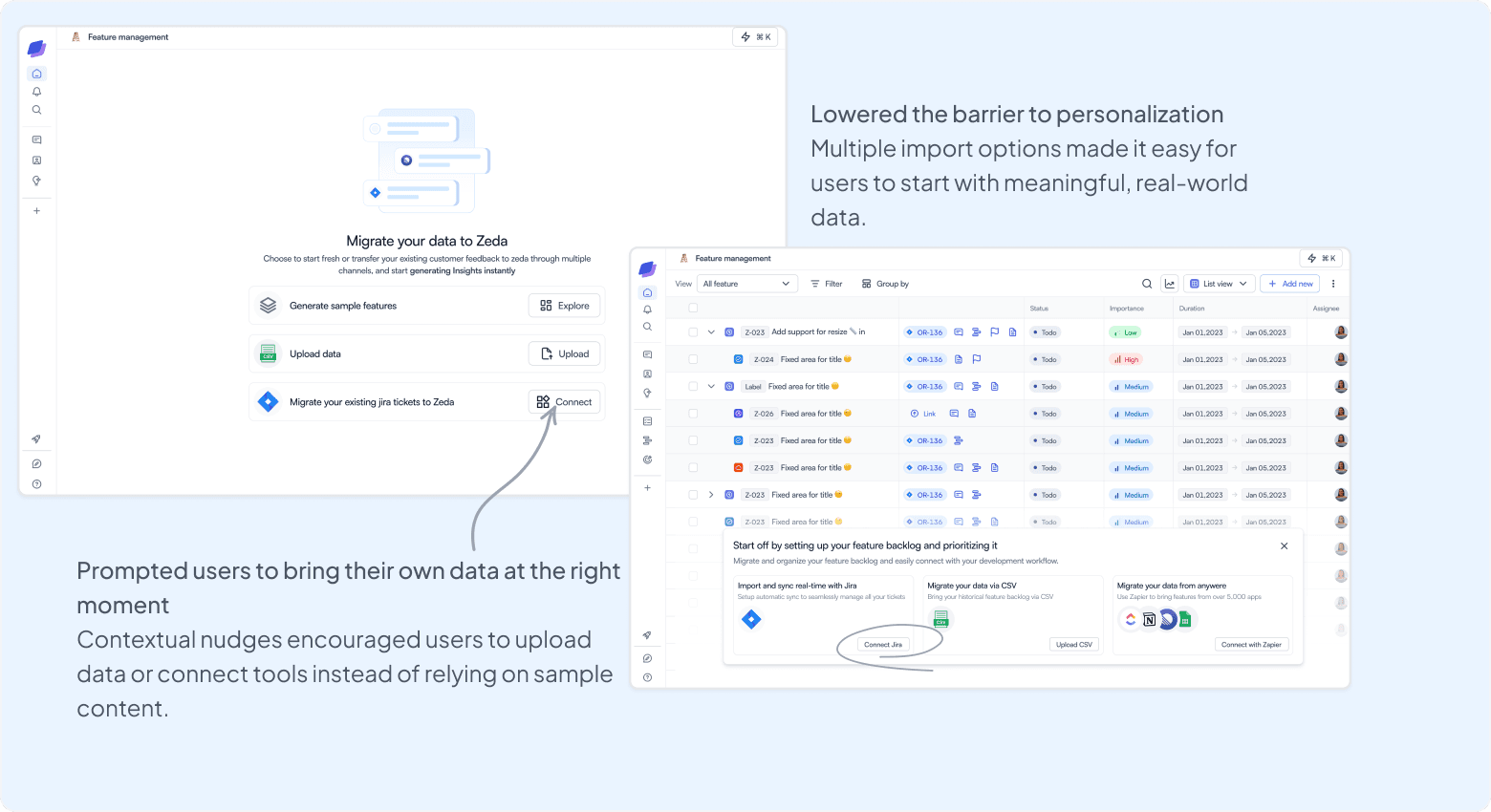
Encouraging users to bring their own data
We introduced contextual nudges that prompt users to upload their own data or integrate existing tools at the right moments in their journey. Guided journeys helped users understand what to do next.
Design principle: Personalization increases relevance and user ownership.
Key improvements
Guided data import
Users are encouraged to upload data or migrate from existing tools instead of relying on sample content.
Contextual nudges
Prompts appear at meaningful moments, reducing overwhelm while guiding users toward setup actions.
Real data over placeholders
Replacing sample data with user-owned content increased relevance and long-term engagement.
Outcomes
What this redesign delivered
This project reinforced that meaningful UX improvements come from reducing friction at the right moments, not from adding more features. The redesign helped users reach value faster and adopt the product more confidently, while laying a scalable foundation for Zeda 2.0.
40%
Increase in user engagement
Users reached value faster through simplified onboarding and clearer guidance.
36%
Increase in product adoption
Streamlined navigation helped users discover and use core features confidently.
25%
Improvement in customer satisfaction
A more intuitive and customizable experience reduced friction across workflows.
50%
Reduction in onboarding time
Fewer steps and autofill enabled users to get started quickly.
Learnings
What this redesign reinforced for me
This project reinforced a few principles that shaped the final experience. Zeda 2.0 became a more approachable, learnable, and scalable product experience.
Iterative design compounds impact
Frequent feedback loops helped us validate decisions early and avoid over-designing solutions.
Personalization drives confidence
Giving users control through module flagging and contextual nudges reduced overwhelm and increased engagement.
Guidance beats documentation
Contextual guides helped users understand what to do next without relying on external help.
Less upfront effort, more early value
Reducing complexity early in the journey improved adoption and long-term retention.
Achievements
Product Hunt recognition
Zeda 2.0 received strong validation from the Product Hunt community:
Dan Olsen
"Congratulations on your launch!"